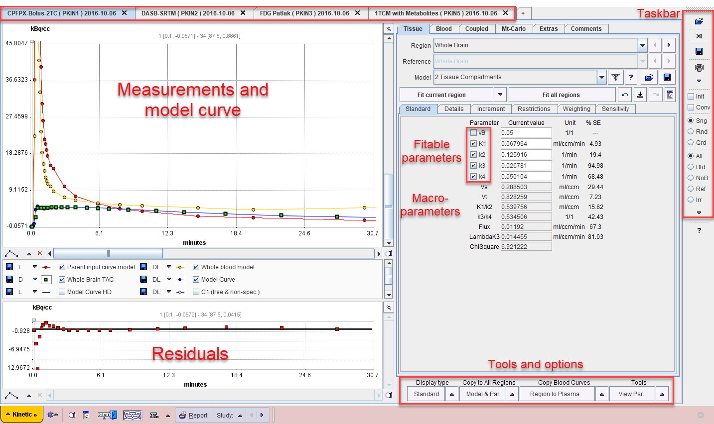
The user interface is organized as illustrated below. The left part of the display visualizes the data, the model and the fit. The green squares represent the tissue measurement values (tissue time-activity curve, TAC), the red circles the input curve, the yellow circles the blood spillover curve (whole blood time-activity curve), and the blue line the calculated model curve with the current model configuration shown to the right. All curves can be shown or hidden using the check boxes in the control area.
The lower curve display shows the weighted residuals, i.e. the difference between the measurement and the model curve multiplied by a weighting factor. Unweighted residuals can also be shown.
The right part gives access to the different models and operations which are described in the following sections.
The taskbar to the right provides shortcuts to loading and saving, as well as the configuration of frequently used model filters and fitting options.